
Stop Sending Visitors on a Wild Goose Chase
I often get resistance from clients when I suggest having multiple contact forms across their website. But I have seen first-hand the positive results of this, and how these forms are being consistently used by website visitors.
There’s a common misconception among website owners that a single “Contact Us” page is enough. After all, it’s there — visitors can find it if they want to get in touch, right? The problem is, that’s a bit like putting the checkout counter at the back of a shop with no signs. You might lose customers before they ever get there.
When someone lands on a page of your website and feels that spark of interest — they want to ask about your tour dates, find out your prices, or simply enquire whether you offer what they’re looking for — that moment is precious. It rarely lasts long. If they have to click away from the page they’re on, wait for another page to load, scan around for an email address, click a mailto link that (hopefully) opens their email client, then compose a message from scratch — the friction alone is enough to lose them. The moment has passed. They move on.
A well-placed contact form, right there on the page they’re already reading, removes that friction entirely.
The Problem with "Click to Contact Us"
Let’s walk through what actually happens when a visitor tries to reach you via a traditional contact setup:
- They read something on your page that prompts them to enquire
- They look for a way to get in touch and find a “Contact Us” link in the menu
- They click it and wait for the page to load
- They find an email address and click it
- Their email client opens — if it’s set up correctly
- They now have to compose an email, write a subject line, structure their message
- They send it and hope for the best
That’s seven steps. Seven points at which a potential customer can drop off, get distracted, or simply lose the motivation to continue. And that’s assuming their device has an email client configured at all — many people, particularly on mobile, simply don’t.
A contact form embedded on the same page collapses that entire process down to two or three steps. They see it, they fill it in, they click send. Done.
Forms That Ask the Right Questions
One of the most underrated advantages of using strategically placed contact forms is the ability to tailor the fields to the specific page they appear on.
A generic contact page with nothing but a name, email, and message box is better than nothing. But imagine you run a tour company or workshop business. A form embedded on your “Mongolia Tours” page could include fields specifically asking:
- Preferred travel dates
- Number of people in the group
- Which specific tour they’re interested in
- Any special requirements
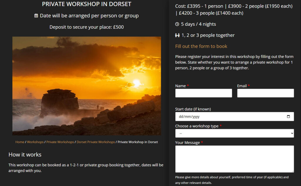
The visitor doesn’t have to compose a long explanatory email. They simply fill in the relevant boxes. And on your end, you receive an enquiry that already contains the key information you need to give a meaningful response — no back-and-forth required. That’s a win for both sides.
For a simpler page, even a single-field form — “Ask us a quick question” — can be enormously effective. It removes any sense of commitment or effort for the visitor and dramatically increases the likelihood of them reaching out.
Anchor Links and In-Page CTAs on Longer Pages
On longer pages — detailed service descriptions, tour pages, workshop listings — it’s good practice to include multiple call-to-action prompts throughout the content rather than expecting visitors to scroll all the way to the bottom to find a form. These CTAs don’t need to open a new page. They can be anchor links that simply scroll the visitor smoothly down to a contact form sitting further down the same page.
This approach keeps the visitor exactly where they are, within the context they’re already engaged with, and gets them to the form in a single click. No new page load, no change of context, no interruption to their experience. It’s a subtle but meaningful improvement to the user journey.
What a Real Client Says
This isn’t just theoretical. I recently worked with Eternal Landscapes, a Mongolia-based tour company, on a full website overhaul that included adding strategically placed lead capture forms throughout their site. Here’s what they had to say:
The results speak for themselves. A broader range of enquiries, a lower barrier to that first point of contact, and a channel — WhatsApp, in this case — that met visitors where they already were. These aren’t abstract improvements; they translate directly into more conversations with potential customers, and ultimately more bookings.
Common Objections — And Why They Don't Hold Up
“Won’t multiple forms clutter the page?”
Not if they’re designed well. A clean, minimal form — even just two or three fields — can sit naturally within the flow of a page without feeling intrusive. Good web design means the form complements the content around it rather than fighting with it.
It’s also worth remembering that you don’t need to plaster a form at every single point on a page. Instead, you can place one form at a natural, well-chosen position — perhaps towards the bottom, or within a dedicated section — and then use CTA buttons throughout the rest of the page as anchor links that jump the visitor straight to it. So whether someone decides to get in touch after reading your opening paragraph or only after scrolling through your full list of services, a single button click gets them there instantly. The form stays in one clean, considered spot; the CTAs do the work of making it feel accessible from anywhere on the page.
“We get too many spam enquiries already.”
Here’s the thing — if you’re displaying your email address as a clickable link on your website, you’re likely getting more spam because of it, not less. Spammers use automated bots to crawl websites and harvest email addresses, adding them to bulk mailing lists without you ever knowing. Once your address is out there, it’s difficult to claw back.
A contact form, by contrast, keeps your email address completely hidden from both visitors and bots. Combined with simple protective measures like Google reCAPTCHA or a honeypot field (a hidden field that catches automated submissions), forms can significantly reduce the volume of spam you receive. In practice, both my clients and I consistently find that we receive less spam through contact forms than we ever did when relying on direct email links. So this objection often turns out to be an argument for forms, not against them.
“Our visitors know where the contact page is.”
Yes of course. But the goal is to capture the ones who wouldn’t have bothered making the extra effort. Those are precisely the people you’re currently losing. That square patch of grass with the worn out muddy trail right across the middle is consistent proof of how people always look for the easier, faster route from A to B. This is even truer on the Internet where people have a much shorter attention span.
In Summary
Placing contact forms thoughtfully across your website — on service pages, tour pages, landing pages, and anywhere a visitor is likely to feel a spark of interest — is one of the most straightforward and effective improvements you can make to your site’s ability to generate enquiries. It reduces friction, it helps you capture better-quality information upfront, and it meets potential customers at exactly the right moment.
If your current website relies entirely on a single contact page to do all the heavy lifting, it may be time to rethink that approach.
Interested in having contact forms added to your website, or would you like to discuss a full website review? Get in touch and let’s talk through what might work best for your business.
